
A good dashboard doesn’t impress people with fancy charts. It calms them down.
When the numbers feel messy—sales up, churn is unclear, traffic spiking for unknown reasons—a dashboard should do one job: tell a clean story at a glance. The best ones don’t look “smart.” They look obvious.
That’s why an ai dashboard generator can be such a practical shortcut. You hand it your KPI list and a bit of context, and it gives you a working layout in minutes. Then you do the human part: tighten the labels, fix the flow, make it feel credible, and share a link.
In this walkthrough, I’ll build a KPI dashboard website using YouWare as an easy dashboard creator. If you want the dashboard to behave like a real internal tool—login, roles, stored data—you can plug in YouBase for authentication and database support. If you’re only aiming for a demo, you can keep it lightweight with sample data and a small scope. Either way, you’ll end up with something you can actually send to people.
Most dashboards fail long before the charts show up. They fail at the input stage: vague KPIs, unclear definitions, no plan for data, and no idea who should see what.
Do these four things and your first draft will come out dramatically better.
Write each KPI with a unit and a plain-English definition. Not because the AI needs it (though it helps). Because your stakeholders do.
A simple list might look like this:
- MRR (USD): monthly recurring revenue, excludes one-time fees
- DAU (users): daily active users with at least one core action
- Trial → Paid (%): conversions within 14 days of trial start
- Churn (%): monthly logo churn
- Open tickets (count): unresolved support tickets
If you skip definitions, you’ll often get charts that look fine but raise questions you can’t answer. And then the dashboard becomes… a meeting generator. Nobody wants that.
You don’t need a perfect pipeline on day one. Pick a direction:
- Static sample data for demos (fast, clean, reliable)
- Manual input via a simple form (good for early internal use)
- Real data from an API/database (best when people will rely on it daily)
Most teams start with sample data, then regret not planning the upgrade path. Keep that in mind.
Dashboards turn into products the moment someone says, “Can we share this with partners?” or “Can sales see this but not that?”
A basic split works in most cases:
- Viewer: can view metrics and drill down
- Admin: can edit KPI targets, manage users, export data
Role thinking is what turns a “dashboard page” into an access dashboard builder.
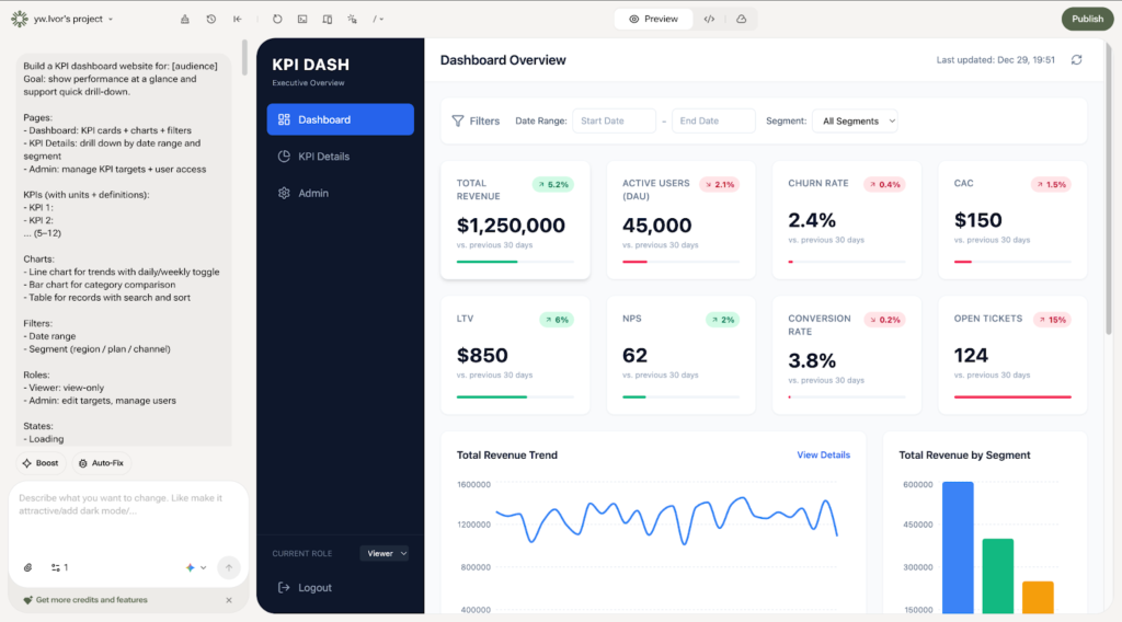
Dashboards don’t need a sprawling site map. Start with:
- Dashboard: overview with KPI cards, charts, filters
- Details: drill-down by date range and segment
- Admin: targets, settings, user access
That’s enough to feel real without becoming a six-week project.
YouWare works well here because it doesn’t just generate screens. It can generate a working, interactive project you can publish and share. That changes how people react. They stop asking “what would happen if…” and start testing what actually happens.
Think of your prompt like a mini spec you’d send to a teammate. You want to lock in the structure: pages, KPIs, charts, filters, roles, and edge states.
You’re not trying to sound clever. You’re trying to be clear. Clarity is what makes an easy dashboard creator workflow feel easy.
After YouWare generates the project, don’t zoom in and nitpick spacing. Run the “60-second test”:
- Do the three pages exist (Dashboard / Details / Admin)?
- Do the KPI cards match your list?
- Are filters visible and usable?
- Can you move through the flow without confusion?
If you can answer “yes” to most of that, you’re already ahead of a traditional build.
This is where dashboards win or lose. People don’t “read” dashboards. They scan them.
Use Visual Editing in YouWare to tighten the parts humans notice first:
- Rename fuzzy labels (“Revenue”) into specific ones (“Monthly Recurring Revenue (MRR)”)
- Add helper text (“MRR excludes one-time fees”)
- Move filters to the top bar so they’re always in sight
- Make one chart the “hero” and demote everything else
A small tip: if every chart looks equally important, none of them are. Pick one that tells the story, then let the rest support it.
Once the flow works, polish it. Not perfection—polish.
YouWare’s Boost can clean up the visual rhythm: typography, spacing, layout balance, and light animation. It’s useful when you need the dashboard to feel “shippable” without spending hours playing designer.
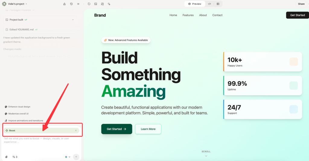
A fast rule that keeps you sane:
- Make the hierarchy obvious: KPIs → primary chart → supporting table
- Keep colors disciplined (dashboards love neutral)
- Make mobile “good enough” for link-sharing
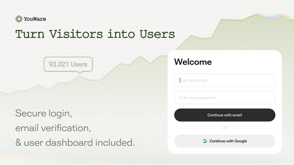
If your dashboard needs to live behind login, remember user roles, or store KPI targets, enable YouBase.
This is the point where YouWare stops feeling like “a generator” and starts feeling like a tool you can build on. With YouBase modules like Auth and Database, you can add:
- Login and role-based access
- Stored KPI records and targets
- Persistent settings and preferences
If you pull data from external APIs, treat secrets like secrets. Store API keys in Secrets rather than exposing them in front-end code. It sounds obvious, but people still ship dashboards that leak keys. Don’t be that person.
Dashboards tend to break in two places: a chart state is missing, or the logic behaves differently than you intended.
YouWare’s Auto-fix helps catch and resolve errors quickly. And if an AI output misses your intent and you need to roll back, Credit Care gives you a safer iteration loop. That matters when you’re working fast and don’t want every experiment to feel expensive.
A dashboard that isn’t shareable is basically a private sketch.
Publish with a shareable URL, then do one last pass before you send it out:
- Can someone understand the story in 10 seconds?
- Are KPI names unambiguous?
- Do empty/error/loading states look intentional?
- Is “Last updated” visible?
If the answer is “mostly,” ship it. Dashboards improve in the wild.
- Vague KPIs → add definitions + units (“Churn % monthly, logo churn”)
- No roles → define Viewer vs Admin and include an Admin page
- No states → add loading/empty/error states so it doesn’t feel brittle
- Over-polishing early → validate navigation and filters before styling
In practice, the fastest path looks like this:
KPI list → clear prompt → generate → visual edits → Boost polish → (optional) YouBase auth/data → publish link
If you want an ai dashboard generator that acts like an easy dashboard creator—and still gives you room to grow into a real dashboard app—YouWare + YouBase is a clean, realistic workflow. It gets you to a shareable first version fast, then lets you evolve it when the dashboard inevitably becomes “more important than we thought.”